ShopDreamUp AI ArtDreamUp
Deviation Actions


Suggested Deviants


Suggested Collections


You Might Like…


Featured in Groups


Description
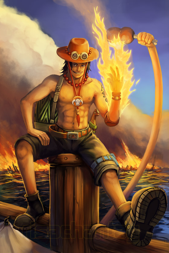
I was looking at some really nice Ace cosplay the other day, and remembered I'd always wanted to do some Ace fanart but had never gotten around to it. I had nothing to do at work today, so I ended up with the majority of the day free to paint this.
EDIT: Had some good feedback, so adjusted the right arm, neck and hat.
Time: 8 hours
Tools: Photoshop CS4 & Wacom Intuos tablet
EDIT: Had some good feedback, so adjusted the right arm, neck and hat.
Time: 8 hours
Tools: Photoshop CS4 & Wacom Intuos tablet
Image size
560x838px 157.82 KB
© 2009 - 2024 Risachantag
Comments198
Join the community to add your comment. Already a deviant? Log In
This work really caught my attention, I'm really liking what you did with the colors here - that contrast between the blue sky and the orange tones of the fire, really beautiful!
I do see some mistakes, mostly in the anatomy. I think some have already been mentioned - the problem with the foreshortening of his left leg & shoe, and the weird positioning of the arm.
But I also notice that you put attention on the muscles of his torso and arms, but his legs seem to lack a bit of shape - I'm far from good in anatomy myself, but there seems to be no calf muscles. That part would be really easy to fix!
I'm really loving that background, with the clouds of smoke, the water, the fire... but I'm not too sure about the lighting on Ace's body. If it's a blue sky day, it would seem that the shadows are a bit too dark - like pertaining to a sunset.
I know the fire is giving another secondary light, but the light of the sun should cause some lighter reflections on the skin also. As I said, I'm not too sure either, because supposing there's more fire on the left side that we don't see, I guess we could get this lighting too!
Overall I think it's an amazing painting, and I'd love to see more like this from you. The atmosphere is just... ace. ;D